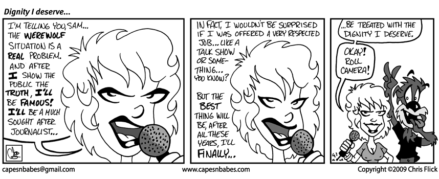
Dignity I deserve…
Hmmm… not really much to say for this post except that I would like you all to know that I AM slowly working on a site re-design. I wireframed the home page design to a point where I’m pretty happy with the structure.
For those unfamiliar, a wireframe in web design can be many things but basically, it its purest form, it’s a simplistic design comp to demonstrate how a particular web site or web site section functions. In a case with WordPress and ComicPress, the functionality is already worked out for you but you still need to figure out the design structure.
Some people like to go all out and design an entire site in Photoshop without any planning stages. I am sometimes like that depending on the project. But for the re-designed Capes & Babes site, I kept running into a brick wall – a designer’s block, if you will. Si, instead of getting bogged down in fancy color schemes, I decided maybe a wireframe would be the best way to go.
Sure enough, that was the problem. Once I created a blank canvass in Fireworks and starting crafting my curved boxes, the design process start to come along MUCH better than anything I previously attempted.
Hopefully, that will stay the same once I start adding colors, textures and backgrounds to the design.
-Chris


